
With the recent news from Google about mobile rendering being a deciding factor in how your website ranks in search results, you may have heard the terms “Mobile Friendly” and/or “Responsive Design” being used.
Mobile-Friendly vs. Responsive
If you’ve ever been to a website that has an m at the beginning of the URL (such as m.cnn.com), then you’ve visited a site that may be “Mobile-Friendly” (in that it has been developed specifically for mobile devices), but it is not Responsive. Usually, these sites (known as “M-Dot” sites) have a link that says “Switch to Desktop View” at the bottom, which is an indicator that the site was created specifically for mobile devices only. When that link is tapped, a small piece of Javascript fires off, and the code that runs it basically says ‘hey, if the user is looking at this website via a device other than a desktop, take them to the desktop version instead.’ In essence, the developer of the website generally has to build two versions of the same website — one for desktop computers and one for mobile devices — which means the cost of site development and maintenance may even double. And that’s just the way it is…
…or was, back in 2008. The web has very much moved on since then.
So what exactly is a “Responsive Website”? It’s a website that can reconfigure its layout to match the device you’re viewing it from. It uses the same code for every device you may view it on, and that code is written in such a way that multi-column items can collapse into a single column on smaller screens, certain elements can be reconfigured, and other elements hidden completely in order to assist in the viewing experience.

How does it work?
Websites primarily achieve Responsiveness by using Media Queries, which are part of the website’s CSS (Cascading Style Sheet) code. CSS code is how we style elements on a website, from the color and size of fonts to the width and height of rows and columns and images.
The CSS Media Query code is very straightforward; it more or less lines things out by making statements such as this to the browser:
- If the device’s screen resolution (a.k.a. ‘viewport’) is between 370px and 768px wide (such as a smartphone), then make these visual adjustments;
- If it’s between 768px and 1024px wide (such as a laptop or tablet), then make these adjustments instead;
- If it’s larger than 1024px wide (such as a desktop computer), then make these adjustments.
With Responsive websites, you completely eliminate the problem of having to create multiple versions of your website. A Responsive website is simple, flexible, and is designed to shift and change to fit whatever device you’re looking at it on; it knows that if you’re looking on a larger screen, it’s alright to spread things out a little or even enlarge them a bit. It responds and automatically works to fit on whatever device you’re on without needing to have a completely different look or URL.
Why is this important?
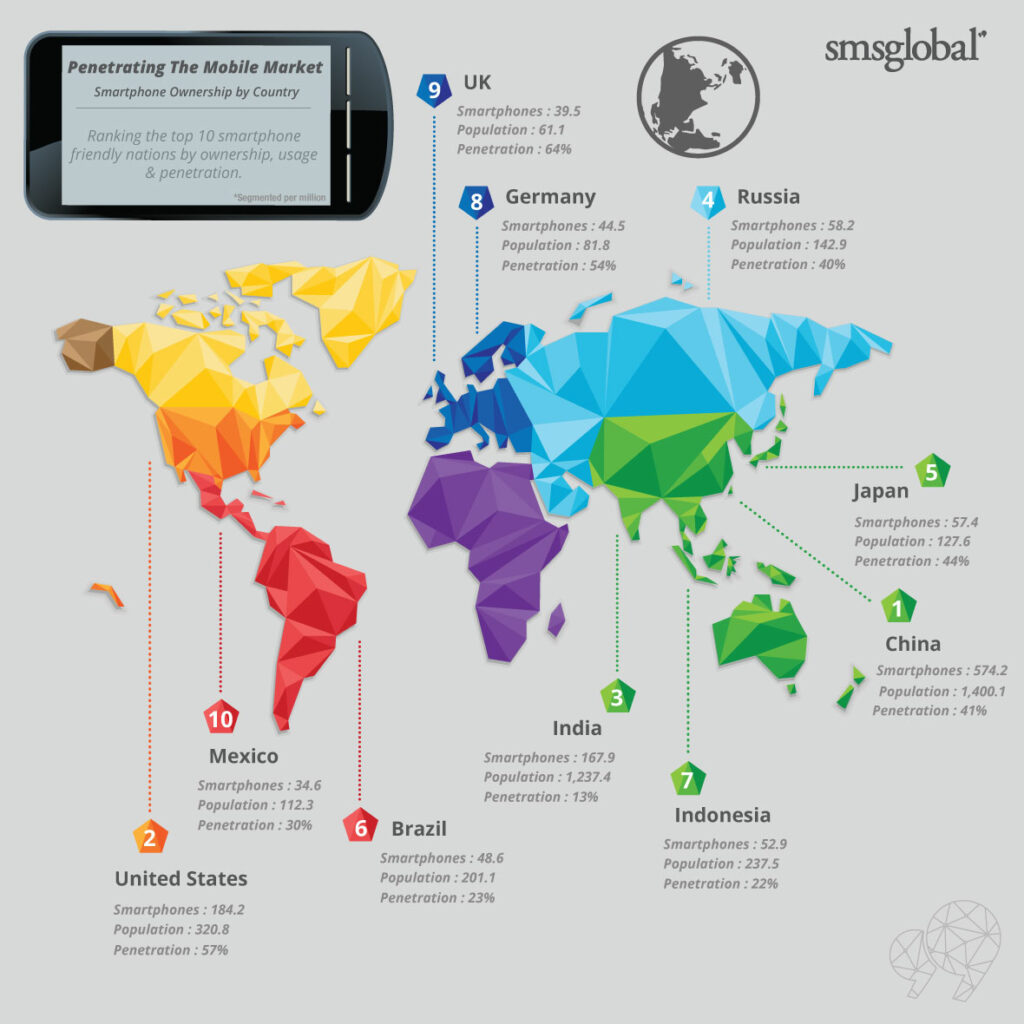
The stats are in on mobile device usage, and it’s pretty clear: surfing the web on mobile devices is already more common than on desktop devices. Check out the smartphone device saturation taking place worldwide:
How do I know if my site is okay?
Not sure if your website is mobile-friendly? Simply use Google’s mobile-friendly testing tool.
And if your site fails the test, feel free to give us a call here at Artmil. We can help transition your website into the latest and greatest code and ensure that it is viewable and enjoyable to use on whatever device your clients and customers may be using.