
One successful venture leads to another.
After the success of the FABREO website, we were contacted by Traci Jao and Kayla Pratt about building a whole new website for TRIDEC. The timing couldn’t have been more perfect: the new branding for the Tri-Cities had just come out, and TRIDEC had a new logo and a new energy that they wanted to communicate online.
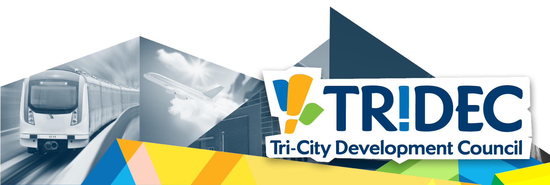
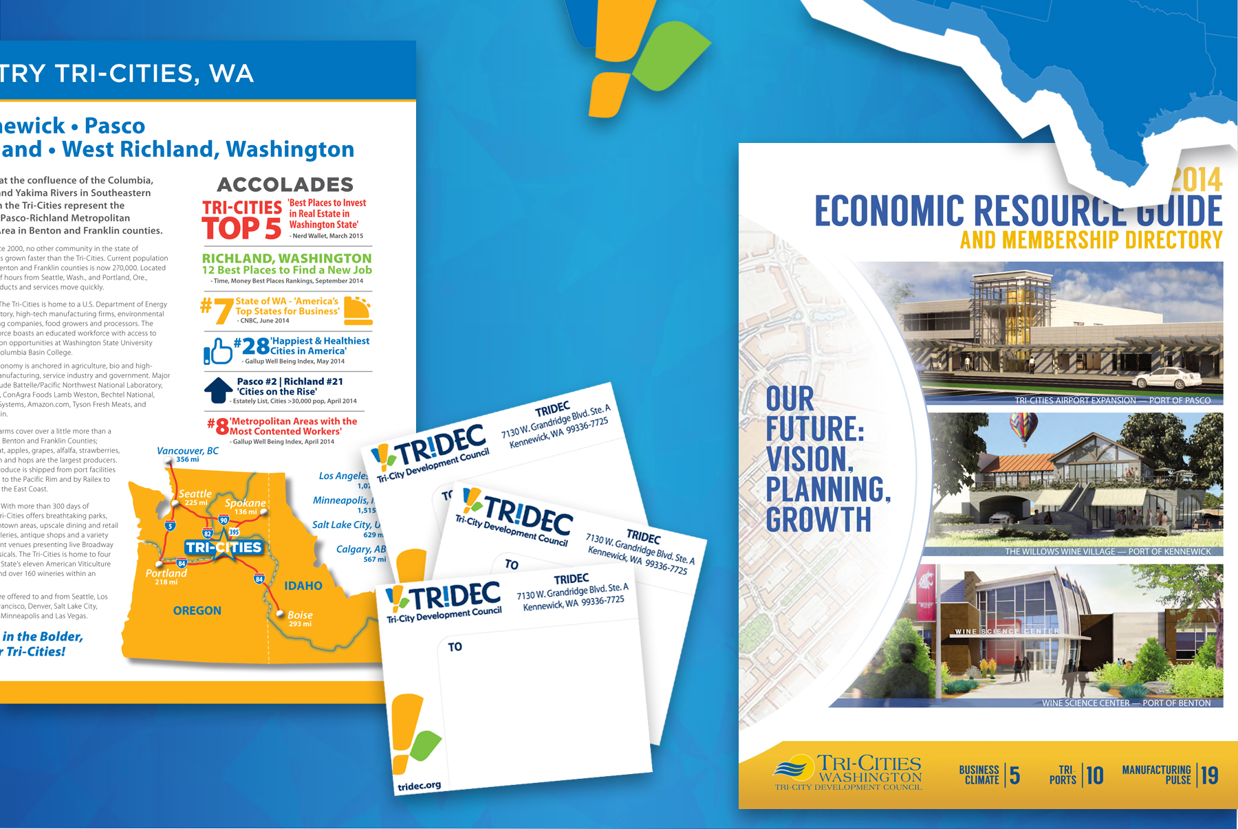
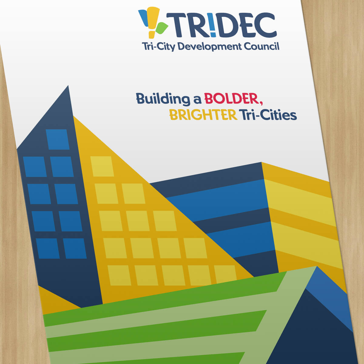
We started with their new brand system and worked to expand it, building a full palette of colors from just 3 tones: a golden yellow, a royal blue, and a bright green. From there, we started working on some visual ideas, and we came back multiple times to this idea of using triangular shapes with varying levels of opacity; that theme resonated, and was carried throughout the site (as well as subsequent print projects).
WHAT WE DID:
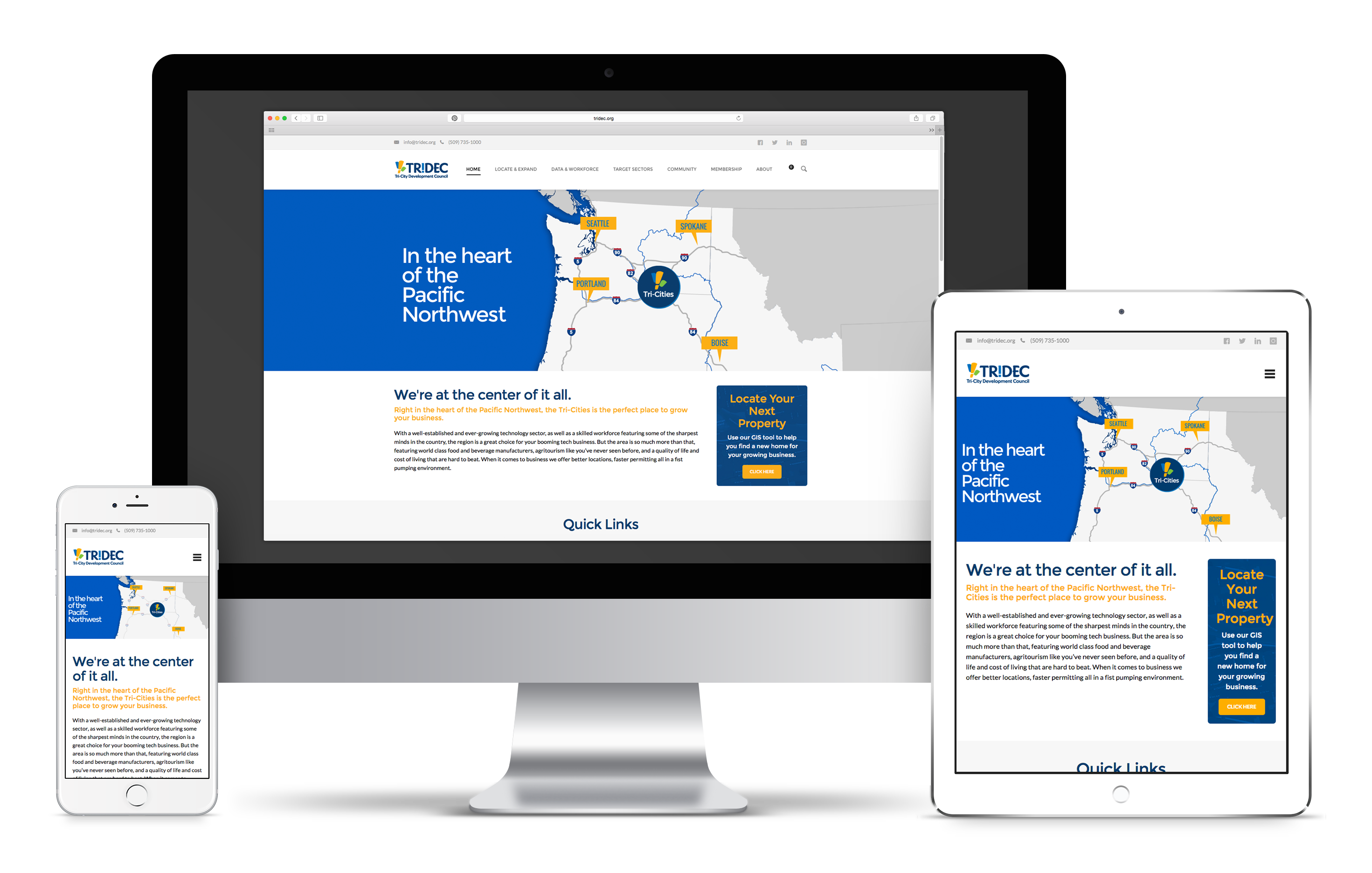
A website that’s easy to use on every device.
A responsive design was critical to the success of TRIDEC’s new website, as they rely on site selectors and business owners to be able to view their website as they’re traveling from place to place — which means it had to work just as well on a smartphone as it did on a desktop computer. We worked for many hours to make visual adjustments and write special code to accomplish that mission.
Brighter, Bolder, Better.
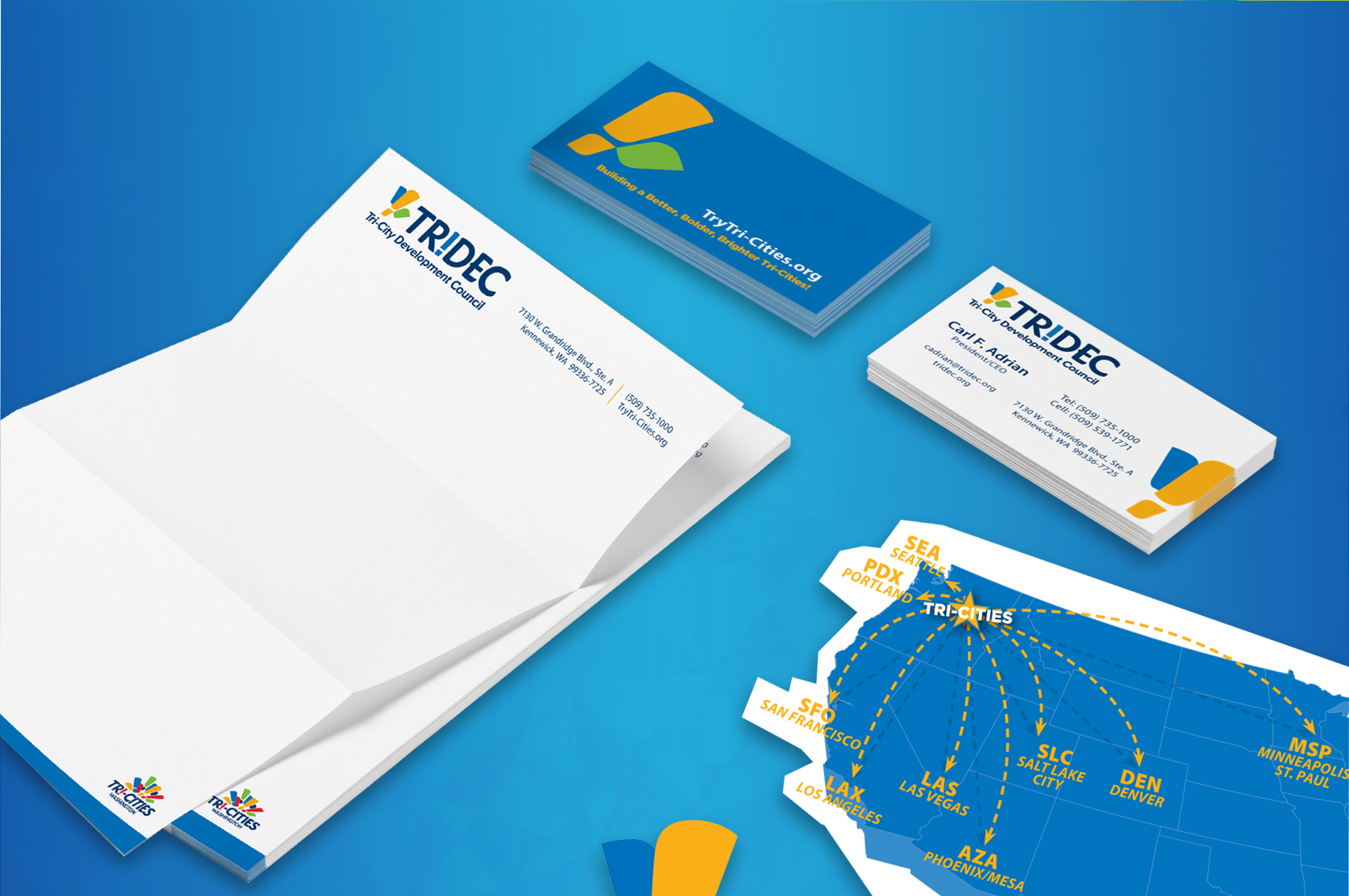
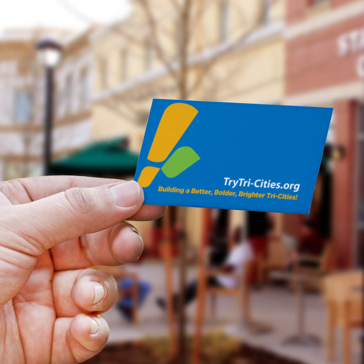
Bringing lots of vibrant color to every piece we created, using our adjusted and expanded color palette, was important in ensuring that the new brand system was very recognizable and easily memorable to those who interact with it.
With the rapid growth of the Tri-Cities area, we wanted to use a more vibrant, commercially-viable energy to communicate the message that the Tri-Cities is the place where a site selector should put down new roots for their expanding companies.
